Abbigail Towery
PORTFOLIO PIECE 1
January 13 ,2017 | Abbie Towery
DESIGN THOUGHTS:
-
Contrast: I used contrast in with the black and white photo and the colorful Fruit Loops. I also liked the contrast between the girl's upset face and the bright happy Fruit Loops.
-
Alignment: I placed the portrait of the young girl in the very center of the page. Then the Fruit Loops box is coming out of the corner of the screen
PHOTOSHOP SKILLS:
-
Layers
-
Clone Stamp to make all the falling cereal pieces
-
eraser tool
-
transform tool

PORTFOLIO PIECE 2
January 16, 2017 | Abbie Towery
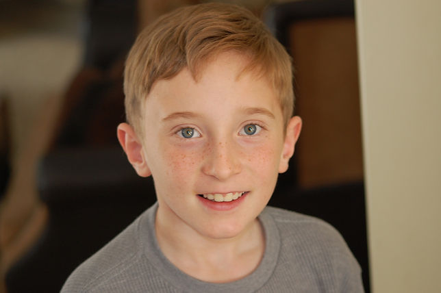
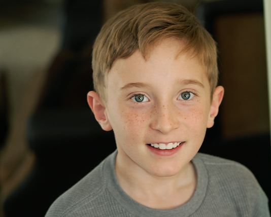
This is a photo I took of my youngest brother last year. I love this photo but the colors are kind of dull. The photo just needed a little bit of color retouching.
DESIGN THOUGHTS:
- For this photo, I wanted to brighten up the colors in the picture to add more contrast and vibrancy.
PHOTOSHOP SKILLS:
- hue/saturation
- levels
- curves
- crop tool
- layers tool
- Photoshop action
-channels and alpha channels
PORTFOLIO PIECE 3
January 24, 2017 | Abbie Towery
For this piece, I decided to make a band poster for my favorite band Mumford and Sons. I love the retro feel and simple design of this poster.
DESIGN THOUGHTS:
- Proximity: I really like the offset text on the bottom right-hand corner. I think it adds a
- Contrast: Red and blue color blocks against the tan background
PHOTOSHOP SKILLS:
- Layers
- Clipping mask
- Blending mode
- Black and White filter
- Text tool
- Shape tool

PORTFOLIO
Portfolio Piece 4
February 6, 2016 | Abbie Towery
DESIGN THOUGHTS: For this portfolio piece, I created a professional resume for myself.
I was super excited to be able to create a portfolio piece that I would be able to use. My inspiration for this piece was the floral arrangement in the top left corner. I loved the colors in the flowers and the vintage feel they brought to the design. I chose colors that COMPLEMENTED the pink, red, and purple tones in the flower display. I really like the CONTRAST that the light gray brings in. I think it really helps balance the whole design and add an element of sophistication. I used ALINEMENT to place each of the informational elements on my resume. I think this piece is a great demonstration of my photoshop skills.
PHOTOSHOP SKILLS:
- Layers
- Shape tool
- Selection tools
- Text tool
- color swatches.

Portfolio Piece 5
February 13, 2016 | Abbie Towery
DESIGN THOUGHTS: For the portfolio piece, I created a magazine cover for ice cream lover.
I used contrast in the bright ice cream picture against the white background. I feel like the simple color scheme added a lot of unity to the design of this piece.
PHOTOSHOP SKILLS:
- layers tool
- text tool
- free transform tool

Portfolio Piece 6
February 2, 2017 | Abbie Towery
For this Portfolio piece, I was dreaming o warmer weather, so I decided to create an infographic about snorkeling in Kauai, Hawaii. Kauai is one of my favorite places on earth. While you are in Kauai I would highly recommend checking out these snorkeling spots.
DESIGN THOUGHTS:
For this piece, I wanted to stick with the tropical theme. I chose a color plate that stuck to the tropical vibe, but also added to the design of the graphic. I really wanted my graphic to be very visual. The beach in Kauai are beautiful I wanted to be able to show them in my infographic. The first thing I picked out for this infographic was the fonts. I chose sophia and bebas Neue to add contrast between the bold font and the frilly cursive. I also liked the allignment of the beach picture on the infographic. It helps your eye follow the path of the beaches. Then to add unity and repitition I used the tropical flowers on the top and the bottom of the graphic.
PHOTOSHOP SKILLS:
- Layer
- Clipping masks
- Shape tool
- Color picker

Sources:
Location Pins: http://www.flaticon.com/
Tropical Flowers: http://www.freepik.com/free-vector/exotic-floral-background_874892.htm
Poipu beach picture: http://www.r7r.com/img/slideshow/1.jpg
lydgate beach picture: http://www.to-hawaii.com/kauai/beaches/images/lydgatebeach/lydgate_beach_park.jpg
Anini Beach Picture: http://www.parrishkauai.com/wp-content/uploads/2012/01/anini-01-949x450a-949x451.jpg
Tunnels Beach picture: http://www.aloha-hawaii.com/wp-content/uploads/2010/08/tunnels-beach.jpg
Koloa Landing Beach: http://www.parrishkauai.com/wp-content/uploads/2016/03/Koloa-Landing-Hero-1-949x451.jpg
Kee Beach: http://www.kauaibeachscoop.com/cms/north-shore/ke-e-beach/159400-photo.jpg
SOURCES:
social media Icons: https://www.iconfinder.com/social-media-icons
Source:
Mumford and sons picture: https://images-na.ssl-images-amazon.com/images/I/61iKyNi5UKL.jpg
Paper texture: http://www.retrosupply.co/blogs/retrosupply-blog/how-to-create-a-matchbook-print-effect-in-photoshop
SOURCES:
black and white photo: https://s-media-cache-ak0.pinimg.com/originals/93/45/fd/9345fd8578ebb6a243b496c64586df49.jpg
Fruit loops Box:
https://upload.wikimedia.org/wikipedia/en/2/2b/Froot-Loops-Box-Small.jpg
http://peaceonthefarm.com/wp-content/uploads/2016/06/fruit-loops-300x300.jpg
Portfolio Piece 7
March 27, 2017 | Abbie Towery
DESIGN THOUGHTS: For this piece, I wanted to create a shattered glass effect on a picture I took of the sunset. I started by turning the picture into a clipping mask on the hexagon. then I went through and added triangle shapes to create the geometric shattered glass effect.
PHOTOSHOP TOOLS:
- Layers
- Clipping Mask
- Shapes Tool

Portfolio piece 8
March 20, 2017| Abbie Towery
DESIGN THOUGHTS: For this portfolio piece, I wanted to keep it really simple. I choose a picture I took of a lighthouse in Kauai, Hawaii over spring break and decided to apply a black and white filter. I thought turning the picture into a black and white picture would be cool because the original picture was so colorful that I wanted to see if it would still be as beautiful if you took the color out. I played around with the colors in the adjustment layer to make the picture have more contrast and to fade out the horizon line to make it look more like a rainy day.
PHOTOSHOP SKILLS:
- Black and white adjustment layer
- Crop tool
- Ruler tool to straighten the horizon


Portfolio Piece 9
April 3, 2017 | Abbie Towery
DESIGN THOUGHTS: I have been finding a bunch of low-poly portraits on Pinterest lately and I wanted to give it a try. The processes of creating low poly pictures are much simpler than I thought it would be, but it is very time-consuming. I wanted to start with an image that was simple but would look cool after I applied this low-poly technique. I choose a storm trooper helmet. It's symmetrical so made it easier to match both of the sides together.
PHOTOSHOP SKILLS:
- Average filter
- Shape Tool
- Layers
- Grouping
- Color picker

Portfolio Piece 10
April 24,2017 | Abbie Towery
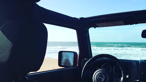
DESIGN THOUGHTS: For this project, I created a GIF using photoshop. I imported a video I took in Kauai, Hawaii this spring. I love this video clip and I thought it would be a good one to make a GIF of. The Video was already color corrected in Premiere pro, so no color correction was done on photoshop because I didn't want to over do it.
PHOTOSHOP SKILL:
- Timeline
- Video Editing
- Save for web Legacy
- Video render
Extra Credit 1
May 1, 2017 | Abbie Towery

Design Thoughts: For this piece I wanted to try and do a double exposure picture. I took a side profile picture of a man and a dark misty forest and put them together.
Photoshop: skills:
- Layers
- Masks
- Blur filter
Sources:
https://www.pexels.com/photo/portrait-of-young-man-251829/
https://static.pexels.com/photos/15382/pexels-photo.jpg
Extra Credit 2
May 1, 2017 | Abbie Towery
Design Thoughts: For this piece, I created a graphic of the Salt Lake Temple in Adobe illustrator then used photoshop to turn it into a poster.
Photoshop Skills:
- Transferring from illustrator to photoshop
- Text Tool
- Shape Tool
- Color filter
